Full Gallery

Sunday, January 11, 2015

Urban Sketching

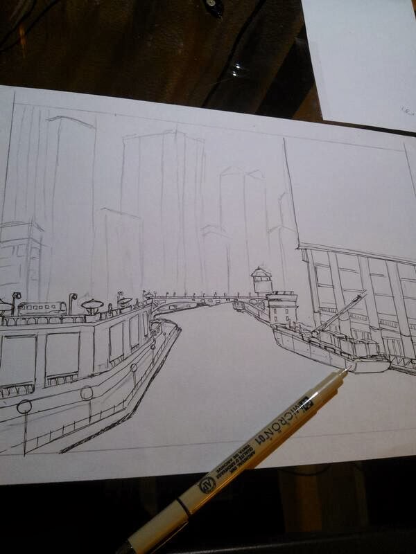
I have been veering away from my original artwork quite a lot recently, so I decided to go back to pen and ink, and work on a little urban sketch of a street in Spain. I photographed a bit of my progress, and it turned out quite lovely. Here we go.


 Started by laying out perspective using pencil (as you can see on the right), and then started to lay out details using my 005 micron. I try to avoid crosshatching at this point.

I continue to lay out details along the city.


In the next photo, the finished product, the crosshatching is also finished, and I added clouds to add variety. This is a relatively monotone picture and the Urban sketch definitely emphasizes detail over value.

Friday, January 9, 2015

Thursday, January 8, 2015

Charcoal Skull

Really have been trying to hone on my fundamentals lately. I wanted to really perfect my concepts of value, so I decided to make a skull (classic) using only charcoal. I feel that charcoal, such a malleable medium, really focuses the artist on the light and shadow, rather than the small details that pen art can so often overfocus on.

Here it is.

Friday, January 2, 2015

Photograph of a Field (Digital Paint with Photoshop CS6)

Decided to create something of my own today using digital painting techniques. I began by laying out a scene of a field and detailing some clouds in the sky:


As you can see here, it is a little blurry/out of focus, so I decided to take that to my advantage and output some creativity. I decided to put a camera in the foreground, in focus, to take away from the overall image, while adding a new element.

I painted it on a separate layer:
I made sure to make the camera more detailed than the background landscape, so that the illusion of depth could be created.

When put together, we get:


After that, I scaled down a copy of the first layer to put on the camera's screen, added some shadows using the brush tool, and made the lighting upon the camera more natural. I created a hand to accompany the camera, then I added a few birds in the air, and changed the hue/saturation of the entire painting slightly to yellow the picture a little. All of this was painted using a Wacom Intuos Small and Photoshop CS6

Final result:


Thursday, January 1, 2015

Digital Painting of a Leopard

Got my hands on a Wacom Tablet, so tried to dip my hands into digital painting. Was quite enjoyable.

Tuesday, December 30, 2014

Leopard Head

Decided that I love leopards more than any other animal today, and I think I will be creating a collection of my leopard illustrations to submit to some competitions. Here is another one:

Timelapse:
Final:

Saturday, December 27, 2014

Painted Leopard

Wow it has been more than 6 months than I've posted here. Well, doesn't really matter now. This is just a place for me to compile my art together really, and I have been busy with school. I have a few pieces to post for the next few weeks, so here goes the first:


Tuesday, March 18, 2014

Monday, March 10, 2014

Lotus Flowers

Here is a piece of art I genuinely felt proud of. This piece took me quite a while and I believe is a really clean cut zentangle that was embodied into a lotus. I came up with the idea while thinking of symbols of chinese culture, and then decided to take a lotus and draw zentangle in it. Anyways, here it is. It was done with my Pigma Micron pens. I think the simplicity of the background really adds the "zen" to zentangle. The lotuses seem to be floating in nowhere, which makes everything so much more magical.

Tuesday, February 18, 2014

Lonely Man

Here is a little something I came up with one day when I was really bored. It was more of the idea than the execution here. I kind of messed up on the perspective. I thought it would be really great to compare a lonely man to himself if he weren't so. There goes the hat.

Monday, February 10, 2014

Zentangle?

Took a second shot at ZenTangle again. I think its a very relaxing and rewarding time killer. I just draw random stuff! This one is using my micron pens.

Tuesday, January 21, 2014

Flight

Ive been enjoying drawing the animals lately. Capturing this owl's intensity with my pen proved to be quite difficult. I find that much of the motion comes from the eyes, and simply the fact that the eyes are so fixated upon one single point seems to bring the owl to life, and show its desire for the prey that it must have been attacking. I completed this work with Speedball SuperBlack India Ink and a Leonardt Soft Drawing nib. I quite like this nib, and prefer it to the Gillot 404 I sometimes use. It provides me a much more variable stroke, as can be seen on  most of the feathers.

Wednesday, January 15, 2014

Lions in Love

Well it has been quite a while since I last posted... about a month to be exact. Well anyhow, I was on vacation, and I haven't really felt the desire to make the effort to use the computer. I was out in nature and taking full advantage of the tranquility. I drew plenty of new ideas, and this is the first I wanted to put up. I think it captures the primal love between parents and their children, and the emotions even animals feel. Animals and us, aren't so different.


Tuesday, December 10, 2013

City Freeway

So I realized that blogging everyday and actually finishing a new piece of art everyday is basically impossible, so I will be posting weekly now (at least I hope to). However, I do have a new piece for you guys, and it will be added to my city collection. This one was pretty tedious and time consuming, and to be honest I did not enjoy working on this piece.

Here is the preliminary sketch, and everything seems to look proportionate, and in perspective. I tried to keep the worm's eye view slightly, to make the city appear larger.


As I began to ink in the illustration, I added details to the sign, and began to display a small sense of depth using crosshatches as to not be confused by each edge on the bridge later.


The primary ink is finished here, and no real sense of light and dark is achieved here except for that which I had added earlier on the bridge.


I finish the drawing by adding tone. The result is decent, and I hope to continue drawing more cities for my collection.


Wednesday, December 4, 2013

Super Complex Origami?

So since I have been kind of busy these days, and I am currently working on my next city illustration, I decided that I should show you guys my other passion: folding origami. I began folding when I was ten, and self taught myself everything I know. Here is the most complex model, as well as my favorite:

"Phoenix 3.5"
Designed by Satoshi Kamiya
Folded by Luke Verlinsky
60 x 60 cm. Tissue Foil
16.5 Hours


Tuesday, December 3, 2013

Review of Sakura Pigma Micron Pen

So a lot of my art is done with this pen, and I'd like to share how great it really is.

I mostly use the 01 02 and 05 thicknesses, because they are all I really need to do the type of crosshatch tonal art that I do. Overall, I think a pen has a few qualities that make it really stand out:

Tone: The micron pen is available in a multitude of colors, but I only use the black. However, the black really stands out as a true black, no matter how thin the line. It does not fade, and is a pigment based pen, and most likely won't fade for a long time.

Variability: A pen really needs to be able to produce a variety of widths, and the Sakura set comes with a ton of different widths, ranging from a really small 005, to a brush. However, the pen is not able to have a variable stroke with different pressures, which is good for very detailed illustrations. After all, if you want to draw something with very fluid strokes and variable lines, it is best for you to use a flex nib dip pen, which I use very often, such as in my leopard and the flowers. I might talk about that in another post.

Durability: The pen is really durable, and the tip doesn't seem to show any signs of wear, even with pressure applied. It will last you a long long time.

On the right is a comparison of the different widths that I use often, and a tonal scale done with the 01 thickness to show how well it can be used to crosshatch and change the image of light and dark.

I hope you enjoyed this review and I HIGHLY recommend the purchase of this pen (and the set).

Check out some of the art I did with this pen on yesterday's post!

Monday, December 2, 2013

Drawing a City Riverline

Here is a progression of photos of a piece that I drew a few weeks ago.

As you can see here, I have mapped out the concept of this city in a B pencil, and I have began to ink in my illustration. For this illustration I used a Sakura Micron Pen with the 01 and 05 thickness. I begin to ink in the bridge, which could be considered the darkest portion of the drawing, but also presents a horizon line for reference.


I continue to add more and more details to my illustration, primarily using the 01 thickness to outline small details.


I was not happy with how my first building turned out, and I promised myself to improve on the way I outlined the buildings.

As the initial outline drew to a close, I felt more and more happy with my result. The buildings (other than the first) looked complex, but not cluttered, and the senses of perspective fit nicely into the cityscape. I would begin to start adding tone and senses of light and shadow next.


So in the final step, I took my 05 in accordance to my 01 and began to crosshatch until the completion.


Although this was one of my favorite pieces, it isn't for sale because I framed it and gave it to my father. I hope he enjoys looking at it as much as I did making it.


Sunday, December 1, 2013

Adding Some Color to My Work?

Well I completed my new piece, and I am a little dissapointed. I like the color, but the depth to which the blood added to my piece is questionable in my eyes. It reflects my style, and takes a minimalist yet rough perspective of the beautiful sakura flower. However, I think it could be better.

Leopard in Thought


Here is the leopard in progress. Some of the spots are being put into place, and the tones begin to emerge.


I finished the leopard, and I have to say, it came out a lot better than I expected. I loved drawing this, and I hope somebody will think it is beautiful enough to take it from me. I am putting it up for sale on ArtPal and RedBubble. I will begin my next piece immediately, and I already have some great thoughts on it.


Here is the beginning of this illustration, and I am  using a B softness drawing pencil, and I ink with a Hiro 40 nib on my nib pen.