Full Gallery

Tuesday, December 10, 2013

City Freeway

So I realized that blogging everyday and actually finishing a new piece of art everyday is basically impossible, so I will be posting weekly now (at least I hope to). However, I do have a new piece for you guys, and it will be added to my city collection. This one was pretty tedious and time consuming, and to be honest I did not enjoy working on this piece.

Here is the preliminary sketch, and everything seems to look proportionate, and in perspective. I tried to keep the worm's eye view slightly, to make the city appear larger.


As I began to ink in the illustration, I added details to the sign, and began to display a small sense of depth using crosshatches as to not be confused by each edge on the bridge later.


The primary ink is finished here, and no real sense of light and dark is achieved here except for that which I had added earlier on the bridge.


I finish the drawing by adding tone. The result is decent, and I hope to continue drawing more cities for my collection.


Wednesday, December 4, 2013

Super Complex Origami?

So since I have been kind of busy these days, and I am currently working on my next city illustration, I decided that I should show you guys my other passion: folding origami. I began folding when I was ten, and self taught myself everything I know. Here is the most complex model, as well as my favorite:

"Phoenix 3.5"
Designed by Satoshi Kamiya
Folded by Luke Verlinsky
60 x 60 cm. Tissue Foil
16.5 Hours


Tuesday, December 3, 2013

Review of Sakura Pigma Micron Pen

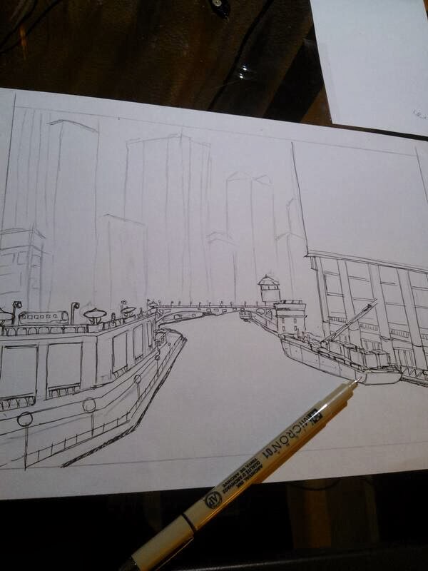
So a lot of my art is done with this pen, and I'd like to share how great it really is.

I mostly use the 01 02 and 05 thicknesses, because they are all I really need to do the type of crosshatch tonal art that I do. Overall, I think a pen has a few qualities that make it really stand out:

Tone: The micron pen is available in a multitude of colors, but I only use the black. However, the black really stands out as a true black, no matter how thin the line. It does not fade, and is a pigment based pen, and most likely won't fade for a long time.

Variability: A pen really needs to be able to produce a variety of widths, and the Sakura set comes with a ton of different widths, ranging from a really small 005, to a brush. However, the pen is not able to have a variable stroke with different pressures, which is good for very detailed illustrations. After all, if you want to draw something with very fluid strokes and variable lines, it is best for you to use a flex nib dip pen, which I use very often, such as in my leopard and the flowers. I might talk about that in another post.

Durability: The pen is really durable, and the tip doesn't seem to show any signs of wear, even with pressure applied. It will last you a long long time.

On the right is a comparison of the different widths that I use often, and a tonal scale done with the 01 thickness to show how well it can be used to crosshatch and change the image of light and dark.

I hope you enjoyed this review and I HIGHLY recommend the purchase of this pen (and the set).

Check out some of the art I did with this pen on yesterday's post!

Monday, December 2, 2013

Drawing a City Riverline

Here is a progression of photos of a piece that I drew a few weeks ago.

As you can see here, I have mapped out the concept of this city in a B pencil, and I have began to ink in my illustration. For this illustration I used a Sakura Micron Pen with the 01 and 05 thickness. I begin to ink in the bridge, which could be considered the darkest portion of the drawing, but also presents a horizon line for reference.


I continue to add more and more details to my illustration, primarily using the 01 thickness to outline small details.


I was not happy with how my first building turned out, and I promised myself to improve on the way I outlined the buildings.

As the initial outline drew to a close, I felt more and more happy with my result. The buildings (other than the first) looked complex, but not cluttered, and the senses of perspective fit nicely into the cityscape. I would begin to start adding tone and senses of light and shadow next.


So in the final step, I took my 05 in accordance to my 01 and began to crosshatch until the completion.


Although this was one of my favorite pieces, it isn't for sale because I framed it and gave it to my father. I hope he enjoys looking at it as much as I did making it.


Sunday, December 1, 2013

Adding Some Color to My Work?

Well I completed my new piece, and I am a little dissapointed. I like the color, but the depth to which the blood added to my piece is questionable in my eyes. It reflects my style, and takes a minimalist yet rough perspective of the beautiful sakura flower. However, I think it could be better.

Leopard in Thought


Here is the leopard in progress. Some of the spots are being put into place, and the tones begin to emerge.


I finished the leopard, and I have to say, it came out a lot better than I expected. I loved drawing this, and I hope somebody will think it is beautiful enough to take it from me. I am putting it up for sale on ArtPal and RedBubble. I will begin my next piece immediately, and I already have some great thoughts on it.


Here is the beginning of this illustration, and I am  using a B softness drawing pencil, and I ink with a Hiro 40 nib on my nib pen.

Hello Blogspot

So today I began a new illustration, the first that I shall be posting on this new blog. I think it is all very exciting how I am beginning to promote myself to the world. I never thought I would actually be good at art, and I cannot say that I am actually good, but I think I'm alright.